FlexBox, or Flexible Box, is a CCS3 layout mode that arranges the elements in a way that they behave predictably when the page changes to accommodate varying screen sizes. With the web going responsive, it's definitely nice to see new standards appearing to aid developers in that. It does not rely on floats and some might find it easier to use than the more traditional display modes. The Flexbox layout can alter it's children's width and/or height to best fill what's on the screen. And I'll mention now, that Bootstraps Grid layout model is probably more versatile in this regard, but this is true CSS way to go about the issue. Also the flex layout is still in the Candidate Recommendation stage, so we'll have to use corresponding browser prefixes in order to be more compliant.
So let's dive into the model a bit. Flexible Boxes are direction-agnostic. Which means they don't fall vertically or horizontally, but more they follow the main axis and cross-axis that are specified. They also don't necessarily get rendered in the order that they appear in the source, like we're so used to seeing with other layouts. But rather they get rendered based on their order.
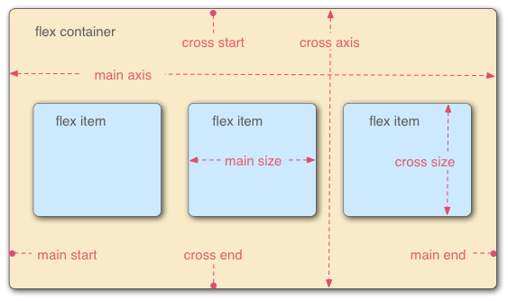
Flexible Boxes Breakdown
The Flex Container parent element is where all of the flex items are contained. You define it by setting the display property to flex or inline-flex. Any elements that are added as children will become flex items. Side Note: Adding plain text to the parent directly will yield an anonymous flex item.
A FlexBox contains 2 axes, the main and the cross. The main axis is the direction in which the flex items will flow, while the cross axis is the direction perpendicular to that.
<style>
.flex
{
      display:flex;
      display: -webkit-flex;
}
</style>

<div class="flex">
<div>this is a flex item</div>
<div>this is another flex item</div>
</div>
The parent container can have the following properties set in order to configure it's flex layout.
- flex-direction: - sets the main axis
- row
- row-reverse
- column
- column-reverse
Here's a few examples:
flex-direction: row
flex-direction:row-reverse
flex-direction: column
flex-direction: column-reverse
- justify-content: - defines how items are laid out across the main axis.
- flex-start
- flex-end
- center
- space-between
- space-around
Here is an example using the "flex-direction: row" from above.
justify-content: flex-end
justify-content: center
justify-content: space-between
justify-content:space-around
-
align-items: aligns flex items of the current flex line the same way as justify-content but in the perpendicular direction.
- flex-start
- flex-end
- center
- baseline
- stretch
- inherit
So just think of the justify-content example above, but vertically spaced had we had a height that was noticeable.
In order to render this layout using the more traditional block format, we'd have to specifically specify each of these child elements in order to begin rendering from the bottom of the parent, or we could add a large amount of padding to the top. But notice how those two alternative methods are kind of sloppy, and for more complex layouts, this could quickly get out of hand.
The Flex Property
Like we weren't confused enough.
The flex property shorthands the flex-grow, flex-shrink, and flex-basis properties to establish the flexibility of the flex items. So let's go through those properties really quick here in order for that to make sense:
-
flex-grow: The CSS flex-grow property specifies the flex grow factor of a flex item. Makes sense. Or not. I'm not quite too sure what that means, so let's try it out and play with the values.
flex-grow: 4
flex-grow: 2
flex-grow: 1
So there we are, the flex-grow property on the flex items determine the overall space that they take up in their parent container.
-
flex-shrink: The CSS flex-shrink property specifies the flex shrink factor of a flex item. Now let's try out a few examples:
flex-shrink: 1 aaaaa aaaaaaa aaaaaa aaaaaa aaaaa
flex-shrink: 2 bbbbbbbbb bbbbb bbbbbb bbbbb bbbbbb b
flex-shrink: 3 ccccc ccccc ccccccc cccccc ccccc cccccc ccccc
For this example I had to add a bit of extra characters in order to see a visible change. But as we can see it's the opposite effect of the flex-grow property.
-
flex-basis: The CSS flex-basis property specifies the flex basis which is the initial main size of a flex item. The property determines the size of the content-box unless specified otherwise using box-sizing.
Flex-basis just like it says is the initial size of a flex item, like you can see above. So these 3 properties can be wrapped up using the flex property and passing the values in respectively per flex item.
So really cool stuff coming out with CSS3. I've already found areas in my websites where I can implement FlexBox layouts and in the process remove tons of needless code and markup. This is just the beginning for responsive layout design as the Grid layout is still on it's way. So I hope that was helpful information and it will be implemented on this page very soon, so feel free to shrink your browser and see the results here.
Stay Sharp. Weekly Insights.
New posts, framework updates and weekly software conversations.
No spam. Unsubscribe anytime.
Walt is a software engineer, startup founder and previous mentor for a coding bootcamp. He has been creating software for the past 20+ years.